


The first step is yours
Portfolio | Zanon Brand Studio
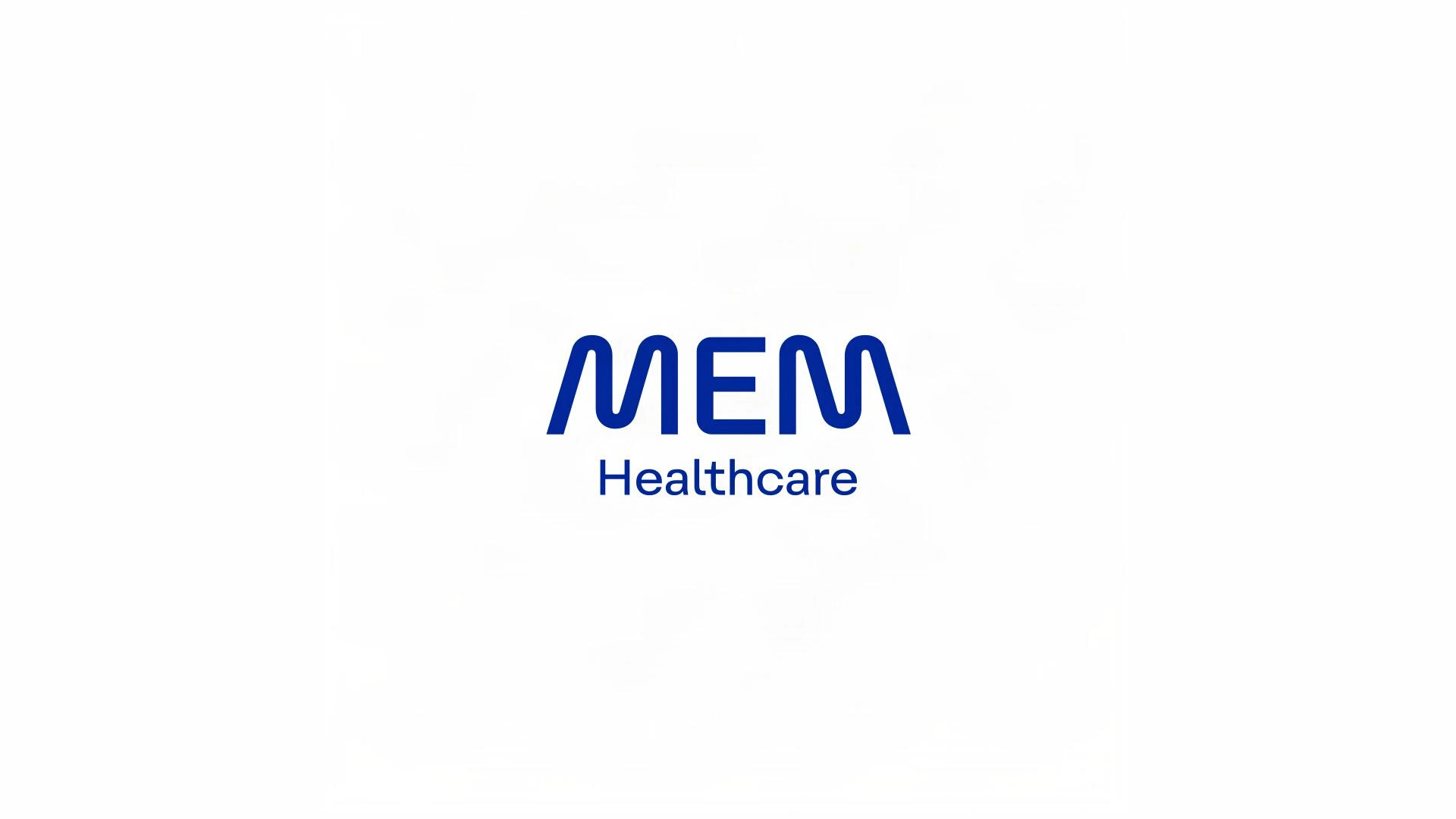
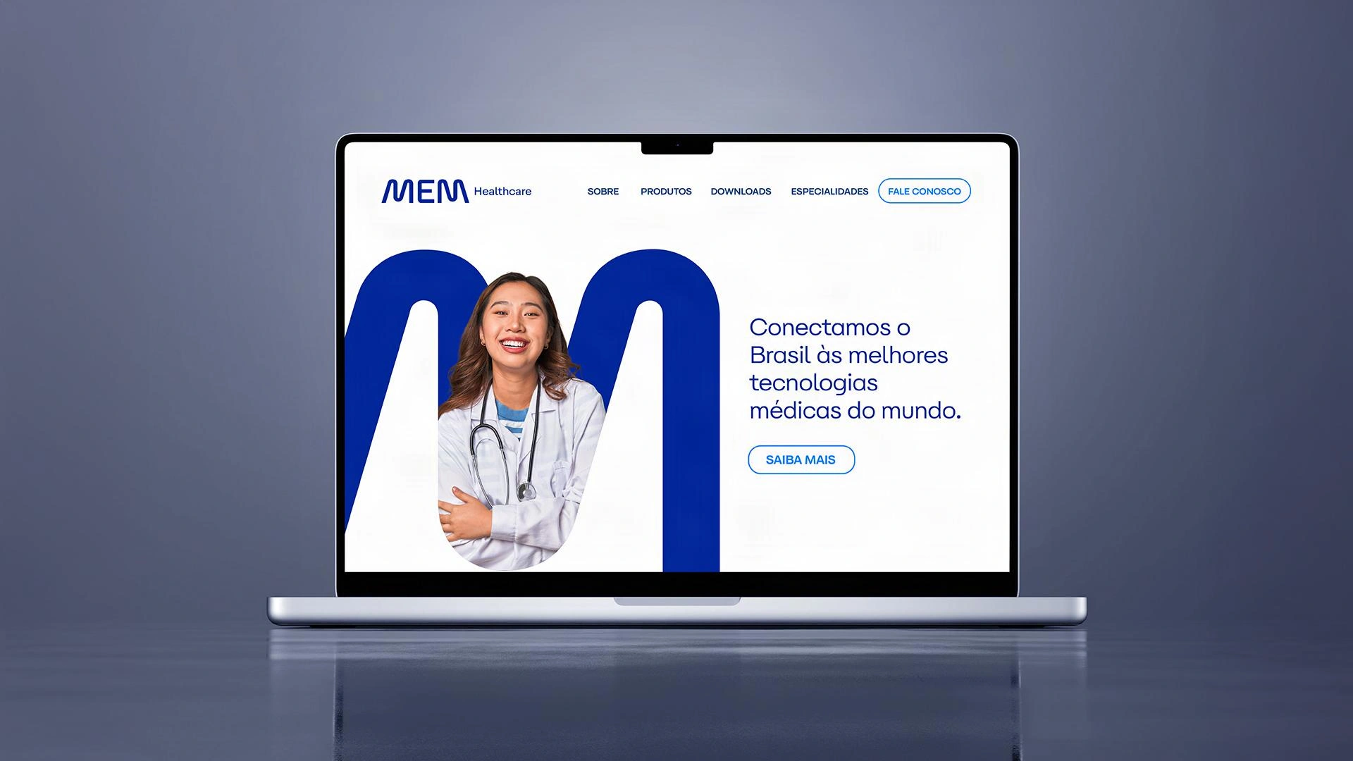
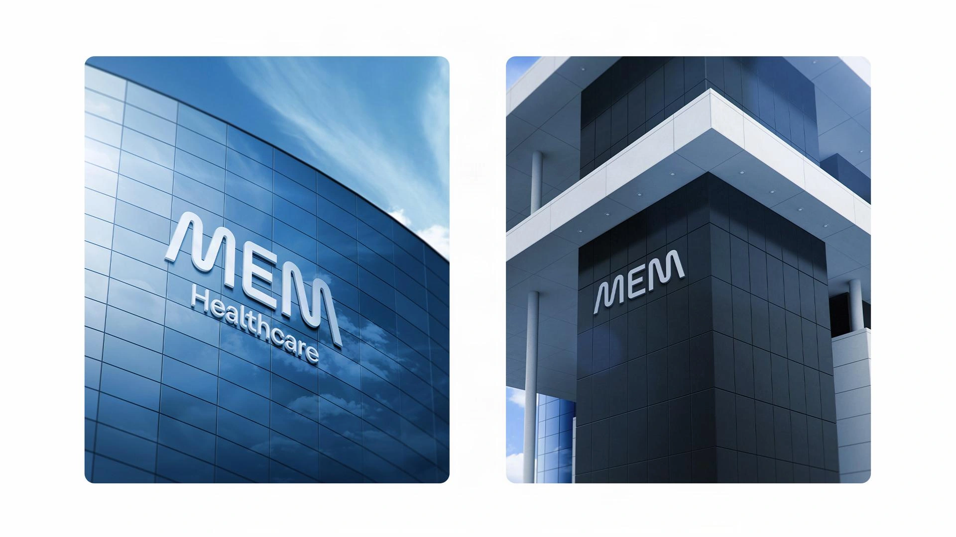
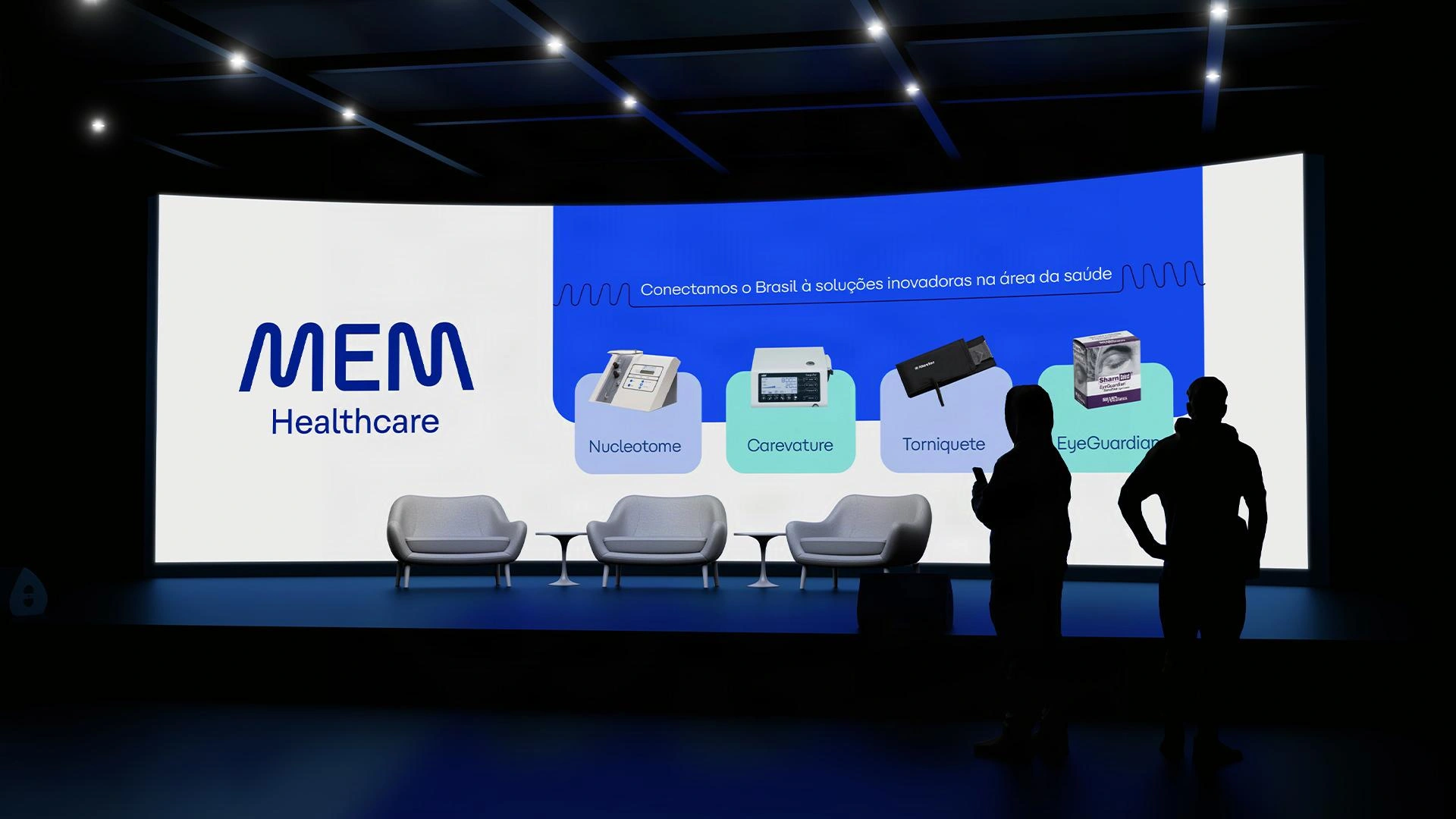
MEM. Leading healthcare innovation in Brazil.
© 2026 Zanon Studio
Country: Brazil
Brand StrategyVisual IdentityVerbal IdentityLogo Creation
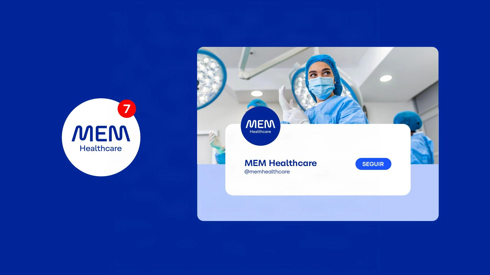
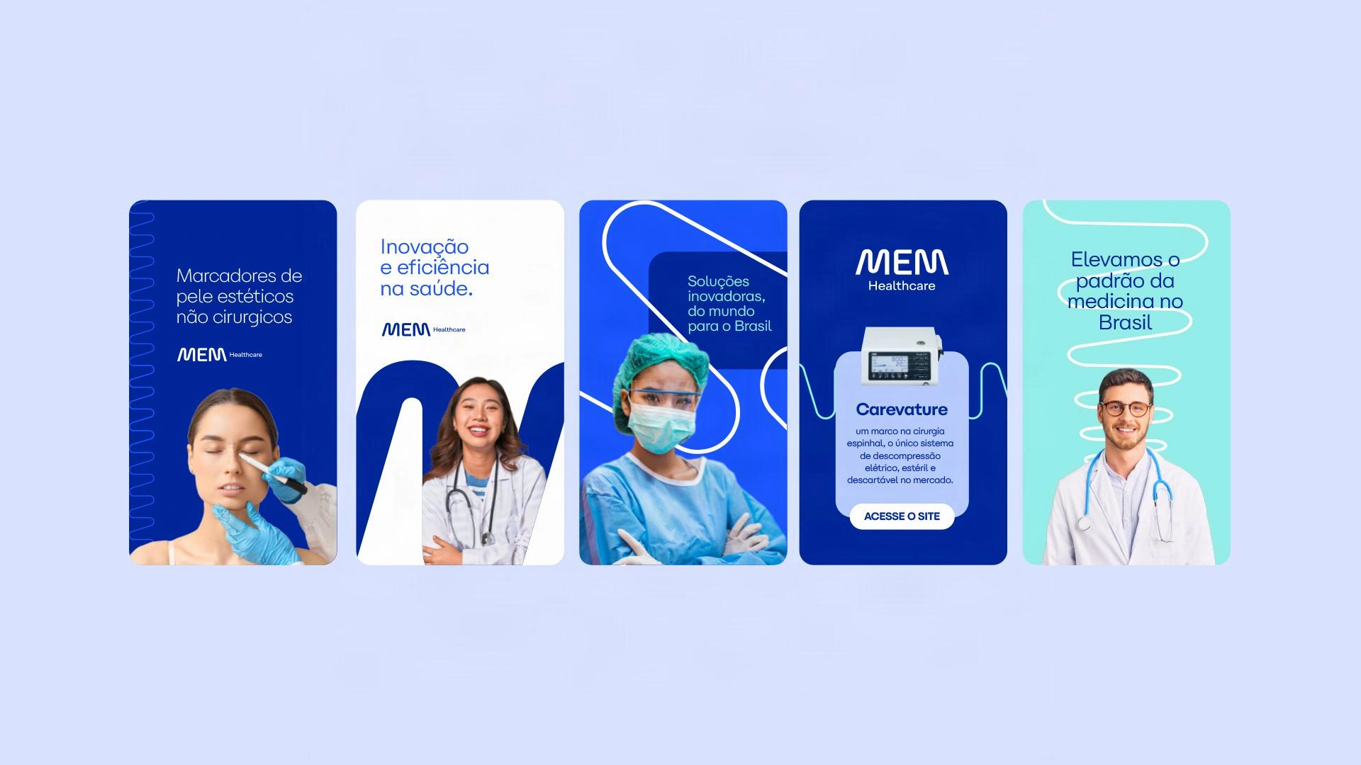
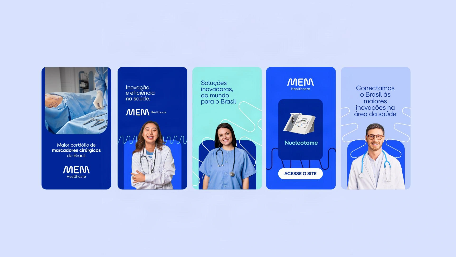
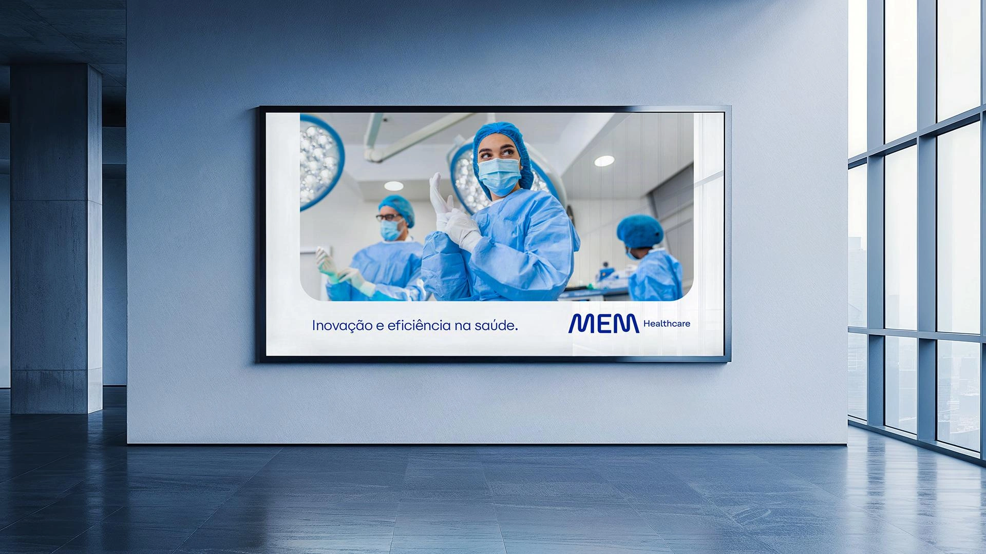
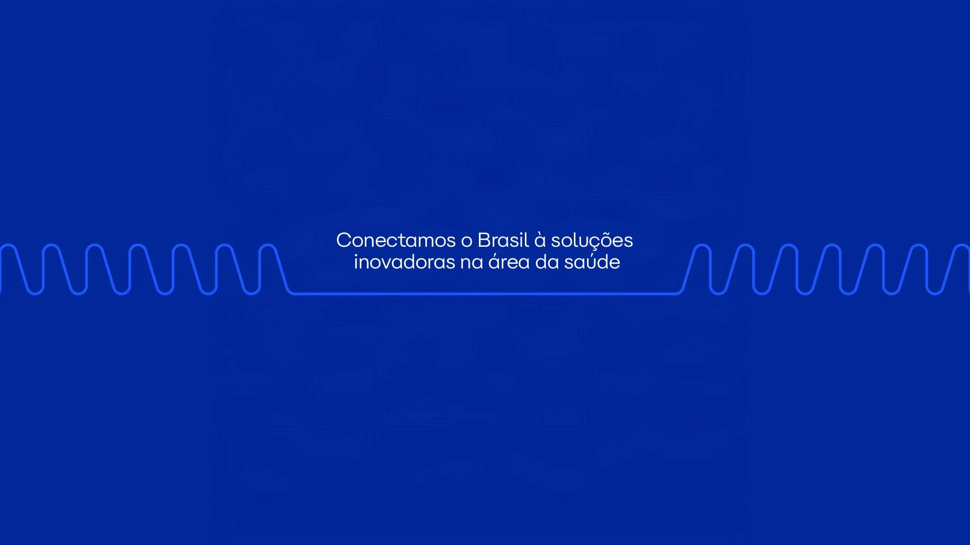
Connecting Brazil to innovative healthcare solutions
The MEM Healthcare branding project is a strategic repositioning case study developed by Zanon Studio. With over 20 years of market experience, MEM, a medical-hospital solutions importer based in São Paulo, sought a brand evolution to reflect its modernity and organize its vast portfolio of global solutions under a new visual identity.
Innovation and Connection in the Medical Sector
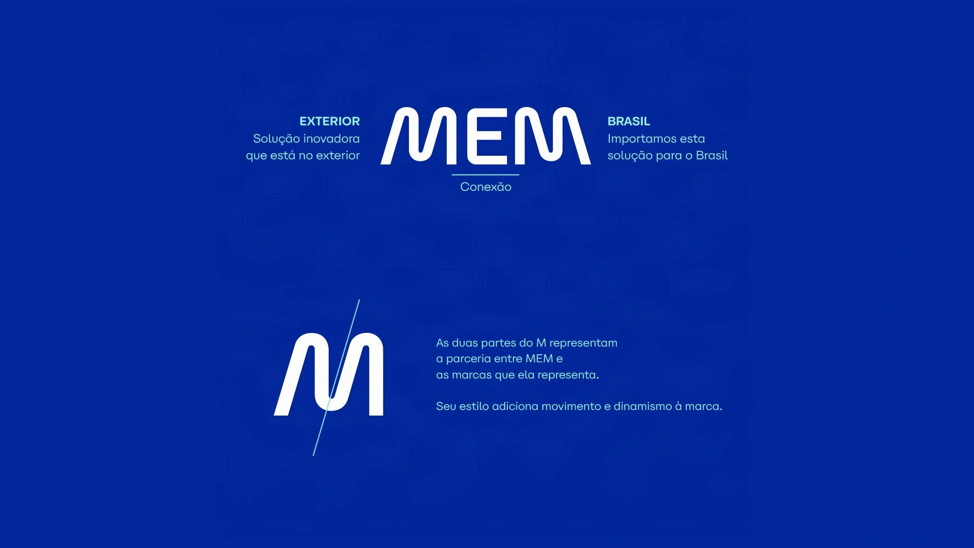
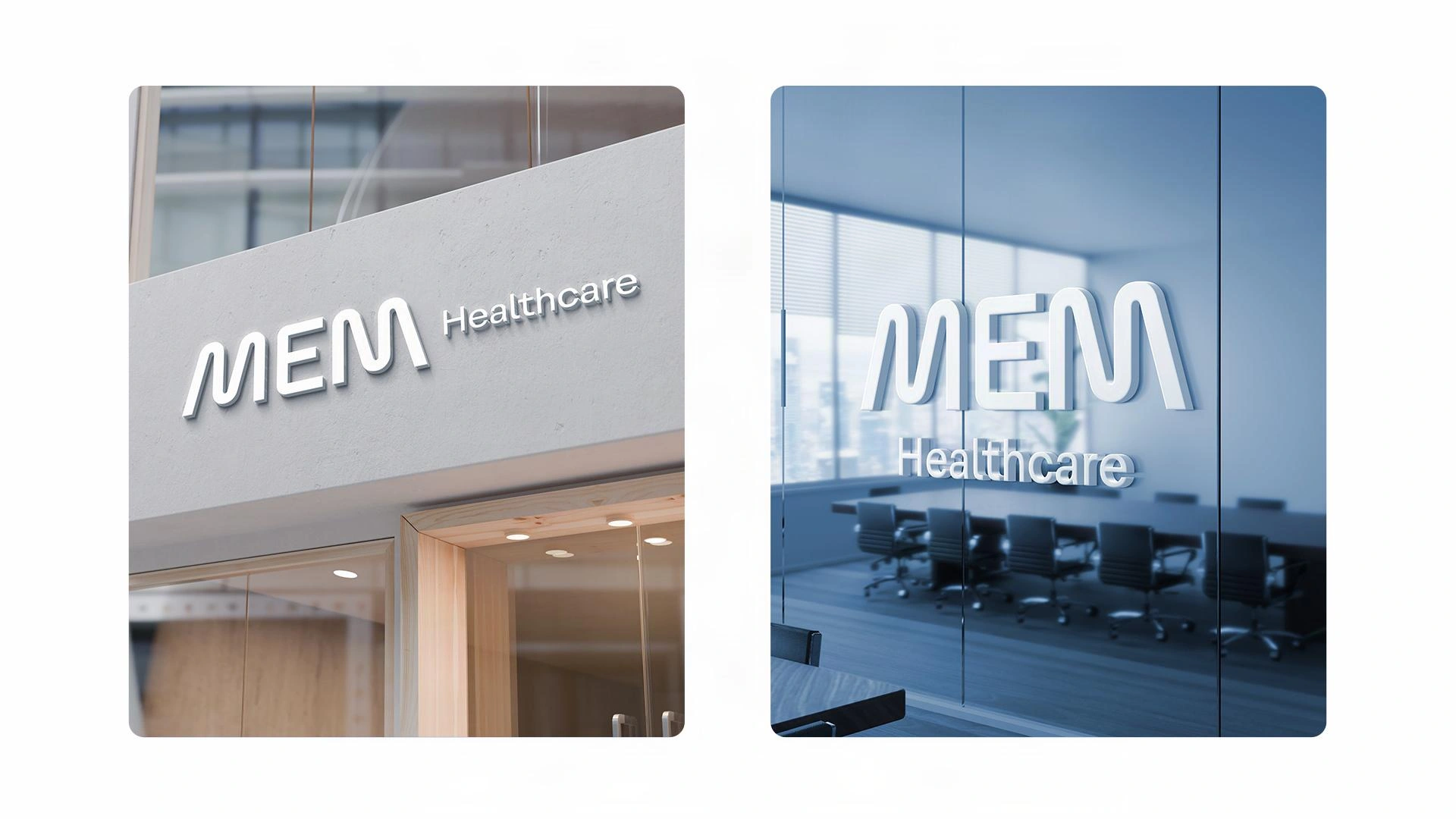
In building the brand, each character was custom-designed to convey a unique personality, grounded in a brand strategy that defined archetypes, a manifesto, and a specific tone of voice. The "M" letters feature a strategic slant to communicate movement and the dynamism of the imported solutions. They were constructed in a mirrored fashion to represent the symmetry between international markets and Brazil.
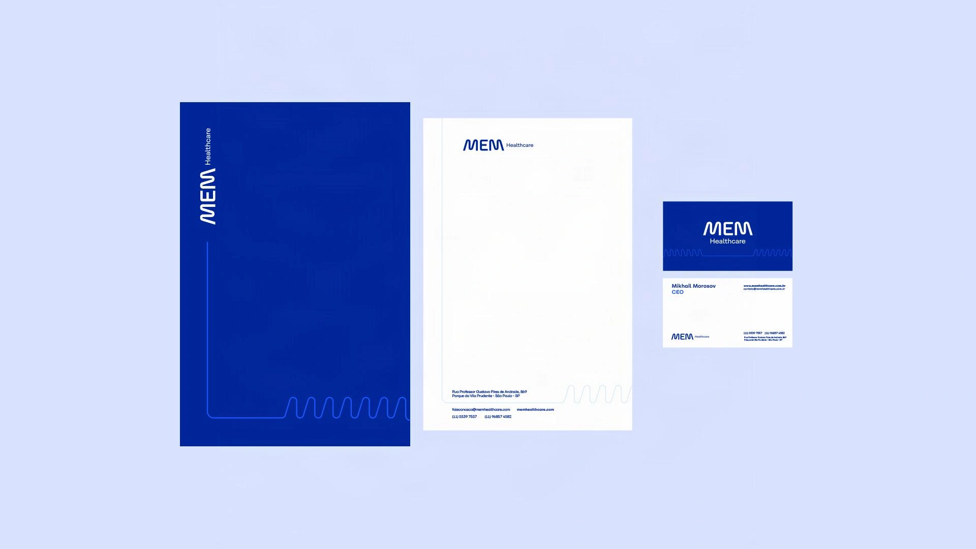
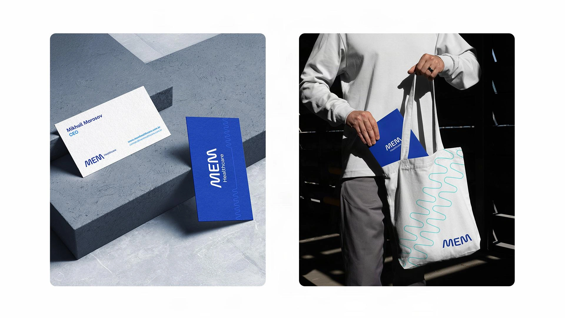
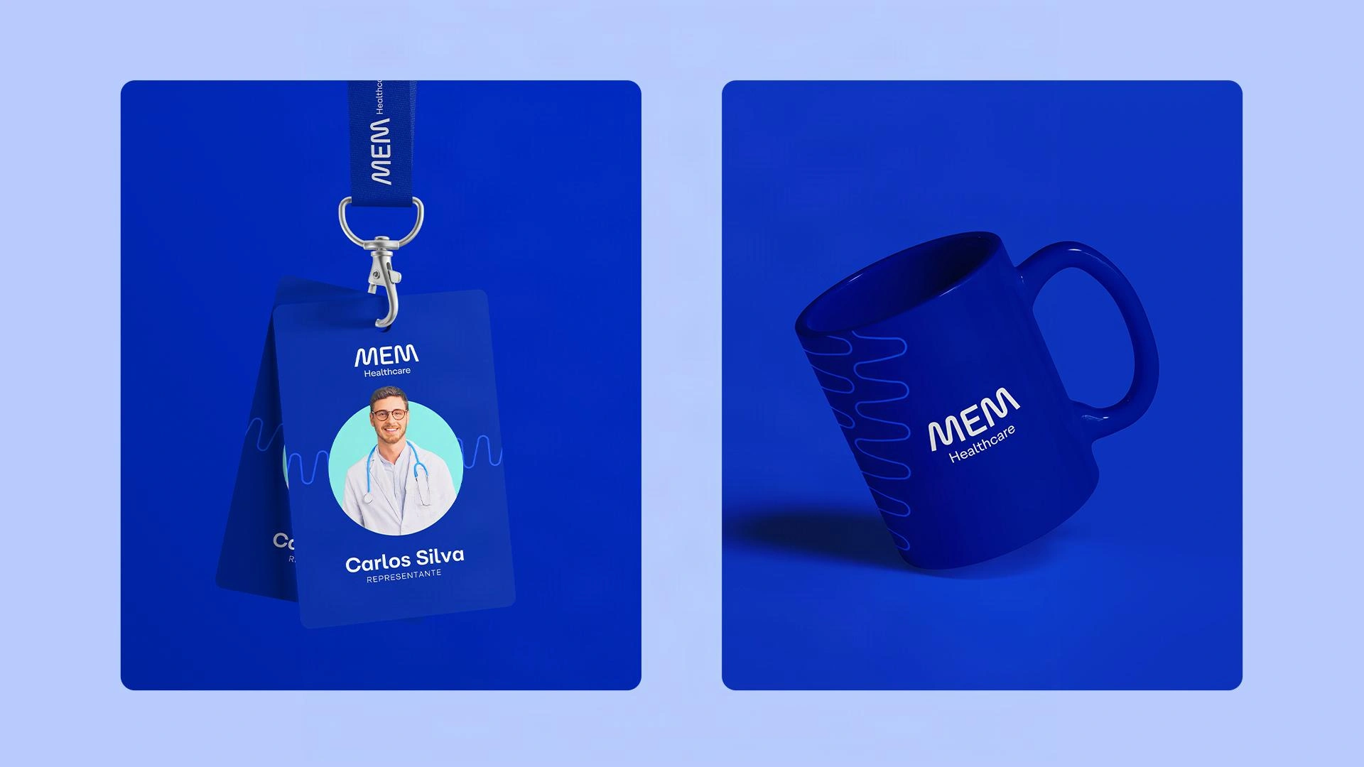
The central "E" acts as the connection link between countries, while the two-part structure of the "M" symbolizes the solid partnership between MEM and the international brands it represents. From the logo's geometry, Zanon Studio developed the entire supporting graphics system, reinforcing the concept of connectivity while subtly referencing vital signs, anchoring the brand visually within the healthcare universe.
Credits: Concept & Direction: Mauricio Zanon | Motion: Múltiplo Design
All rights reserved © Zanon Studio


Let's build
aaaaa
Zanon Type Foundry
